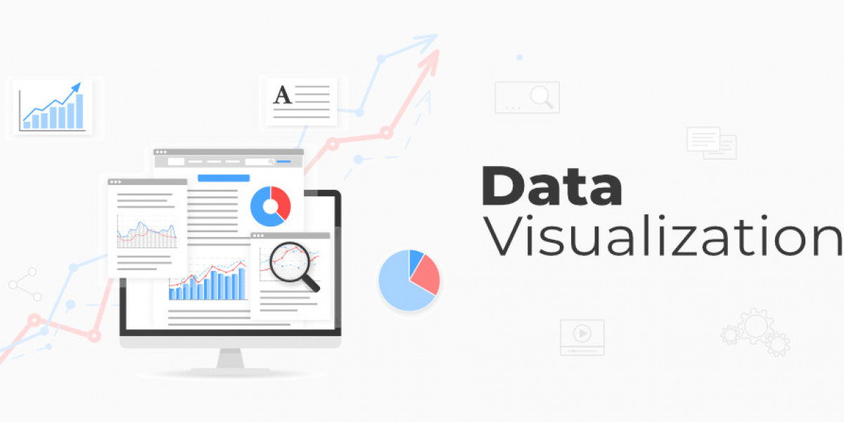
The number of companies using data science to take their business forward is exploding. And one important element of this data science industry is data visualization. The vast amount of data collected and insights generated out of these data can sometimes be complex and hard to understand by non-technical stakeholders and decision-makers. This is where data visualization plays an important role in conveying insights and findings clearly, concisely, and in a beautiful easy-to-understand manner.
Data visualization helps to convert numbers into compelling visual narratives. And if you are looking to make a career in data science, then you cannot ignore the importance of learning this incredible technique that’s kind of mandatory for your career.
Here’s why learning data visualization is important for all aspiring data scientists:
1. Identify patterns and insights easily
As a human, we can process images and visuals faster than texts and numbers. According to studies by researchers at the University of Minnesota, it was found that the human brain can process visuals 60,000 times faster than text. Therefore, the use of charts, graphs, and other kinds of visual elements helps data scientists to easily identify patterns, trends, and outliers that might be difficult to identify in spreadsheets.
For example, if there is a dataset on customer demographics and their purchase history, then with the help of bar charts, data scientists can easily identify which age group spends the most, or identify hidden relations between income and preferred product category with the help of a scatter plot.
These hidden insights are often invisible in the raw data but can prove to be very effective in informed decision-making.
2. Facilitates communication
As mentioned earlier, data visualization is an effective way of communicating complex insights and findings in an easy-to-understand manner. A recent survey by McKinsey and Company found that 70% of executives believe that they are not properly able to leverage the power of data for effective decision-making. One major reason could be ineffective communication. Therefore, data visualization can help data scientists in such cases to bridge the communication gap.
Data storytelling
Audiences resonate more closely with stories than visuals. With the help of data visualization, data scientists can create compelling narratives. They can strategically use color, chart types, annotations, etc. to communicate with their audience and guide them through the data journey effectively by highlighting key points and sparking curiosity.
A study published in Harvard Business Review mentioned information presented in the form of a story can be 22 times more effective and memorable than the facts alone.
3. Encourages collaboration
Data science projects are not a single man’s chore. It is a team effort consisting of data science professionals with varied expertise. So, data scientists often need to collaborate with data engineers, data analysts, business leaders, etc., to maximize the results of their data science projects. Data visualization is particularly effective in this scenario as it serves as a common language that facilitates communication and collaboration.
With the interactive dashboard, each team member can explore the data independently, ask questions, and gain deeper insights.
4. Enhances Analytical Thinking
Well, data visualization isn’t just about creating beautiful visuals, and aesthetics. Effective visualization requires data scientists to have a deep understanding of data to understand it properly. To create beautiful and interactive data visualization, they must understand which type of chart and graphs to use, which color combination will be best to convey the message properly, and which type of charts and graphs to avoid so as not to clutter the presentation. This entire process helps enhance their critical thinking skills.
How to learn Data Visualization?
So, if you want to master the art and science of data visualization to excel in your data science career, then there are numerous resources to help you with that. All aspiring data scientists must hone their data visualization skills and know how to use popular tools like Tableau, Power BI, and other Python libraries like Matplotlib and Seaborn. These tools have user-friendly interfaces and huge amounts of learning materials to equip you with all the skills and knowledge required to use these tools.
You can learn them via online courses, books, online forums, YouTube videos, or data science certifications. Some universities offer full-time data science courses as well that cover data visualization. If you are looking for short-term learning programs then data science bootcamps and data science certifications with courses can be great options.
Conclusion
The amount of data generated is exploding and therefore the demand for data science professionals with data visualization skills will continue to rise. The rise of AI and ML will further fuel this demand as these models are quite complex and require clear and concise visualization to understand their outputs.
Therefore, all students and young professionals committed to making a career in data science must master this incredible technique to take their careers to new heights.